Stranger Things Cinematography: A Nostalgic Journey Through Lighting, Camera, and Lenses
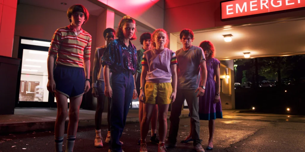
In the realm of modern television, few shows have captivated audiences quite like Netflix’s “Stranger Things.” Set in the 1980s, this sci-fi horror series has not only won hearts with its compelling storytelling but also mesmerized viewers with its distinct visual style. The show’s cinematic look is a time machine, transporting us back to the era of classic summer blockbusters and coming-of-age adventures.
But how did the creators, the Duffer Brothers, and their talented cinematography team craft this nostalgic visual palette? In this deep dive, we’ll explore the meticulous cinematography of “Stranger Things,” breaking down the lighting techniques, color choices, and camera work that make the show a feast for the eyes. Whether you’re a budding filmmaker, a cinematography enthusiast, or just a fan of the show, this journey will give you a newfound appreciation for the artistry behind every frame.
Chapter 1: Lighting – The Soft Glow of Nostalgia
At the heart of “Stranger Things'” visual appeal is its unique approach to lighting. The show’s cinematographers, notably Tim Ives and Tod Campbell, have drawn inspiration from the masters of 1980s cinema to create a look that’s both realistic and subtly stylized.
The Alan Daviau Influence
Remember the warm, inviting glow in Steven Spielberg’s “E.T.” or the soft, naturalistic lighting in Barry Levinson’s “Avalon”? That’s the magic of cinematographer Alan Daviau, whose work heavily influenced the lighting in “Stranger Things.” Ives, in particular, aimed to replicate Daviau’s softness and realism with a touch of heightened reality.
Imagine you’re in the Byers’ living room. Notice how the light feels warm and cozy, with hints of orange? Now look at the window – see that cool blue light peeking through? This interplay of warm and cool tones is a signature move in “Stranger Things.” It’s like a visual representation of the show’s blend of heartwarming moments and chilling encounters.
The Book Light Technique
Ever tried to take a selfie with a harsh overhead light? Not flattering, right? That’s why Ives uses a technique called “book lighting.” Picture this: instead of pointing a light directly at the actors (which can create unflattering shadows), they bounce the light off a reflective surface and then pass it through a diffuser. The result? A light so soft it could make even a Demogorgon look cuddly.
But wait, there’s more! They also use crates to control the light spill. This makes the actors pop from the background, kind of like how the kids in the show stand out against the dark, mysterious world they’re navigating.
Front Lighting: Making Memories
Now, let’s step outside. Remember those old family photos your parents took on sunny days? They often have a flat, evenly lit look. That’s front lighting – where the light source is right behind the camera. Most cinematographers avoid this like the plague, but in “Stranger Things,” it’s a secret weapon.
Inspired by photographer William Edelson, Ives uses front lighting to make exterior scenes feel like cherished memories. It’s as if you’re flipping through an old photo album, each scene a snapshot of the kids’ adventures.
Shadows and Scares
But “Stranger Things” isn’t all warm fuzzies; it’s also a horror show. When things get spooky, the lighting takes a dramatic turn. Ives and Campbell play with deep, dark shadows to ramp up the fear factor. Campbell, in particular, is a fan of single light sources and silhouettes. Think of the scenes in the Upside Down or when the demogorgons attack – the harsh shadows and high contrast make your heart race, right?
Chapter 2: Color – The Palette of an Era
If lighting sets the mood in “Stranger Things,” color defines the era. The show’s use of color is like a time capsule, evolving with each season to reflect the changing times and the characters’ growth.
Season 1: Muted Beginnings
Remember how season 1 felt a bit grim? That’s no accident. The color palette was intentionally muted, mirroring the uncertain, often bleak circumstances the characters faced. It’s like the visual equivalent of the kids’ initial helplessness against the otherworldly threats.
Season 2: A Splash of Color
As the kids start to take control of their situation in season 2, the colors brighten up a bit. It’s subtle, but you might notice more vibrant hues creeping in. It’s like the show is saying, “Hey, there’s hope on the horizon!”
Season 3: Neon Summer
But it’s season 3 where the color really pops. Set during summer vacation, this season is a neon-drenched love letter to the ’80s. The centerpiece? Starcourt Mall. This isn’t just a set; it’s a color explosion that would make a rainbow jealous.
The Duffer Brothers shifted gears here, moving away from Spielberg’s muted tones to the vibrant worlds of John Carpenter and Robert Zemeckis. It’s a visual cue that our gang isn’t just battling monsters; they’re also navigating the neon-lit maze of adolescence.
Remember that epic finale in the mall? Those flickering neon lights weren’t just for show. Ives and his team spent a month and a half rigging that lighting setup. It’s like they built their own mini Las Vegas Strip in Hawkins, Indiana!
Chapter 3: Cinematic Look & Feel – Big Screen in Your Living Room
The Duffer Brothers had one mission: make “Stranger Things” feel like a blockbuster movie, not a TV show. Every decision, from camera choice to aspect ratio, was made with this cinematic vision in mind.
The Quest for the Perfect Camera
Imagine you’re the cinematographer, and you need to pick a camera that’ll make your show look like it was shot on film, not digital. After a ton of tests, the team chose the RED Dragon. Why? As Ives put it, it reminded him of Kodak 5293 film stock – “velvety and smooth.” In other words, it has that classic film look without the hassle of actual film.
Lenses: A Blast from the Past
Now, let’s talk lenses. The team mainly used Leica Primes, lenses that hearken back to the ’70s and ’80s. These lenses create a flatter, softer image compared to modern, high-contrast lenses. It’s like they’re gently blurring the edges of reality, perfect for a show that blends the ordinary with the extraordinary.
And here’s a pro tip from Ives: he rarely lets the f-stop go above 2.8. In simple terms, this means the background is almost always slightly out of focus. It’s like the camera is mirroring the kids’ tunnel vision as they focus on their mission, the world around them a soft blur.
Wide Lenses and Big Emotions
Remember those intense close-ups in “E.T.” and “Jaws”? The Duffer Brothers sure do. They use wide lenses for close-ups, just like Spielberg. This technique makes emotions feel larger than life. When Eleven uses her powers or when the gang faces a monster, those wide-lens close-ups make you feel every ounce of their fear, determination, or triumph.
The Final Touches: Grain and Aspect Ratio
In post-production, they add a bit of film grain. It’s like adding a vintage filter to your Instagram pics, but way more sophisticated. They actually overlay a real film stock (5298) onto the digital image. The result? It looks and feels like you’re watching an ’80s movie.
Lastly, they chose a 2:1 aspect ratio. Most TV shows are 16:9, but 2:1 gives that wider, letterboxed movie feel. It’s like your TV has magically transformed into a cinema screen.
Conclusion: The Power of Visual Storytelling
“Stranger Things” is more than just a great story; it’s a masterclass in visual storytelling. The Duffer Brothers and their team didn’t just set out to tell a story set in the ’80s; they wanted to make you feel like you’re watching an unearthed gem from that era.
From the soft, Daviau-inspired lighting that warms your heart one moment and chills your spine the next, to the evolving color palettes that mirror the characters’ journeys, every visual choice is deliberate. The cinematic camera work, with its film-like quality and emotion-magnifying lenses, turns your living room into a time-traveling movie theater.
But here’s the real magic: all these techniques serve the story. The visuals aren’t just pretty pictures; they’re an integral part of the narrative. They enhance the nostalgia, amplify the scares, and make the characters’ triumphs feel all the more grand.
For aspiring filmmakers and content creators, “Stranger Things” offers a vital lesson. Having a clear vision and specific references can transform your work. The Duffer Brothers didn’t just vaguely aim for an “’80s vibe.” They studied specific films, photographers, and cinematographers. They had a plan, right down to the type of film grain they’d add in post.
So, the next time you’re planning your project, whether it’s a YouTube video, a short film, or maybe your own Netflix series, take a page from the “Stranger Things” playbook. Study your influences, plan meticulously, and let your visuals do more than just look good – let them tell your story.
In the end, “Stranger Things” proves that with passion, planning, and a keen eye for detail, you can create something truly extraordinary. After all, in the world of filmmaking, stranger things have happened. Who knows? Your visually stunning, storytelling masterpiece could be next.